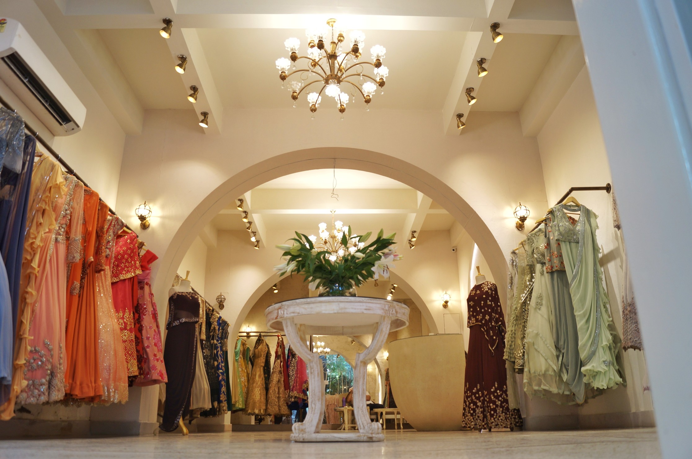
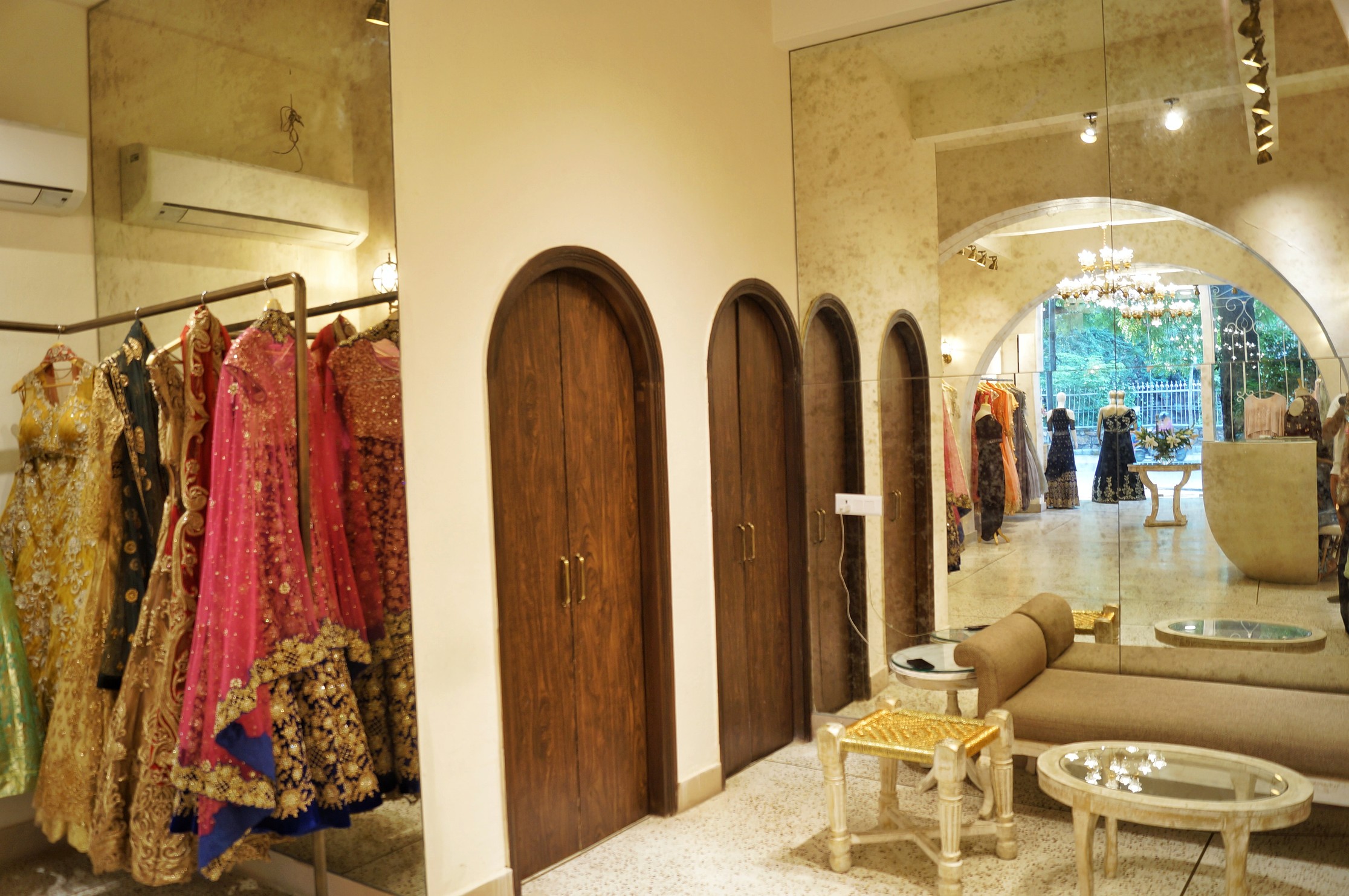
Retail Design is visceral in nature. Apart from creating a good-looking store with aesthetically pleasing displays, retail store design is a well-thought-out strategy to set up a store in a way to optimize space and sales so that even if a salesman is unavailable, the store can engage its customers sell itself. The way a store is set up can help establish brand identity.
Retail Design began to grow in the middle of 19th century. That was when the chain stores began to evolve. In the 1960s, retail design saw another evolution with the creation of boutiques. Retail design revolves around basic five principles-
· Explicate Space- The overall area is defined by fine geometry and sharp edges. The use of mirror adds depth and its strategic placement helps to enhance the intensity of the corridor.
· Organize Space- The arrangement of shelves on either sides leaves a void in the centre creating the ease of movement for customers.
· Sequential Experience- Keeping the customers thought process in mind, the retailers know what products to be placed in which part of the store, so as to make the former move around the whole area.
· Visual Merchandising- Windows are the eyes of a retail store and should hence; tell a story that is carried through the space. The trick is to explore creative interpretations, while always placing the product at the heart of the display.
· Customer Participation- It is important for a retail store to slow down the customer and the key to doing that lies in putting large, eye- catching display at the entrance.
Once the overall structure and circulation of the space has been determined, the atmosphere and thematic of the space must be created through lighting, sound, materials and visual branding. These design elements will cohesively have the greatest impact on the consumer and thus the level of productivity that could be achieved.
I thought of providing maximum natural light and that was achieved by all glass facades. It also enabled to provide customers with an unobstructed look of the interiors.
The availability of natural light in the store adds clarity and interest to the space and also helps customers in examining the quality of merchandise. The next important feature was the lighting. With dramatic use of chandeliers, brass spotlights and antique wall lights, the colour of lights being yellow, a festive and celebratory semblance was achieved.
The colours used for the design of the boutique is predominantly simple, the major colour being white and shades of cream with antique brass finishes for lights and furniture, the architect has also used green as an indirect colour in the form of plants at the entrance which can be seen from the inside through the unanimously beautiful steel jail work.
With the emergence of internet and online shopping trends, the retail faced a downside. The only way to put up with it was by understanding the need of customers and providing them with exactly that. Damon Richards said, “Your customer doesn’t care how much you know until they know how much you care.” The regal lighting and simple colour scheme enhances the overall experience of coming to this place, the design is so subtle and exasperatingly simple yet it speaks volumes.
At UB Designs our focus is on state-of-art retail designs, following the brand language and visual merchandising as its core


