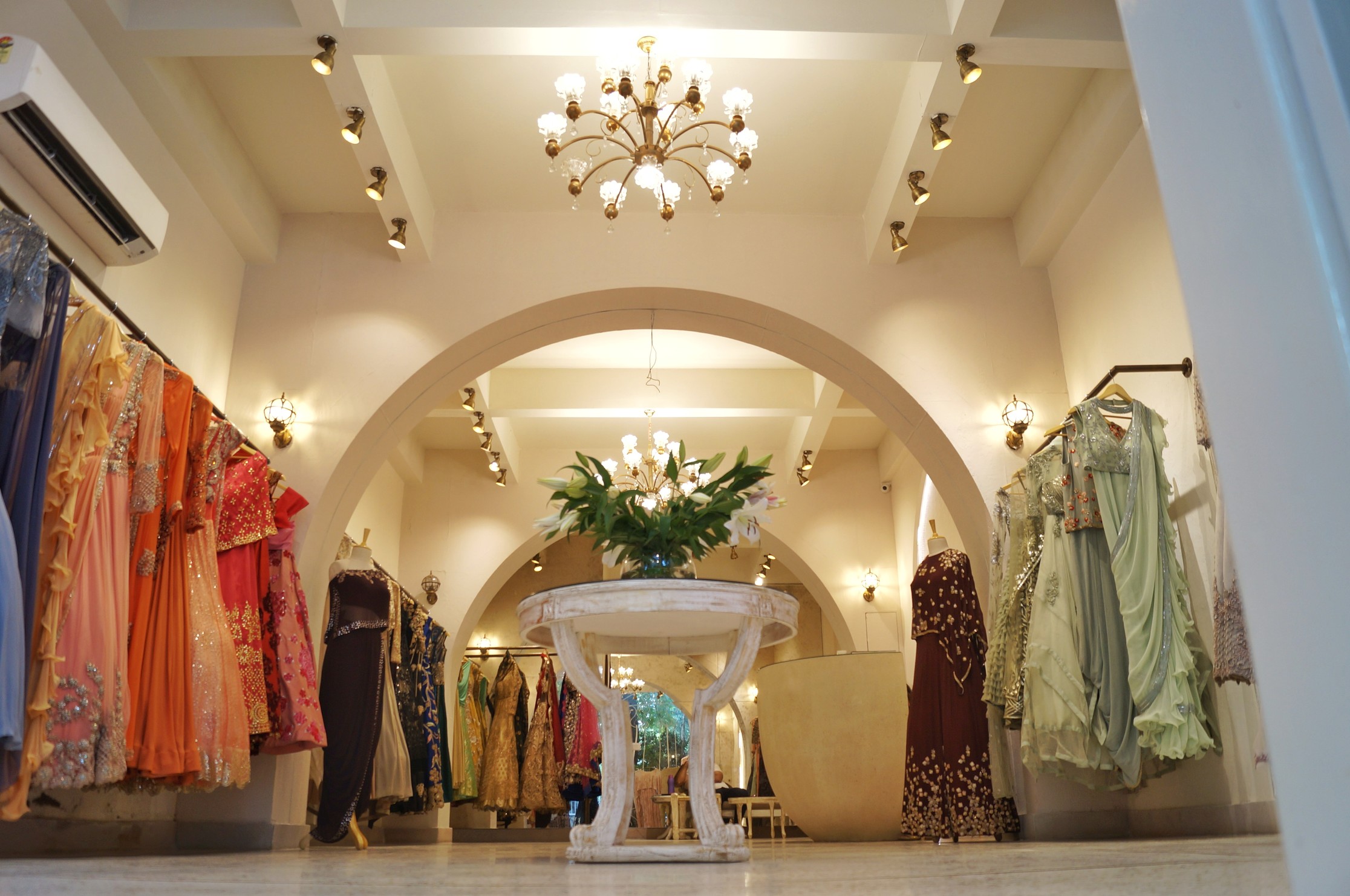
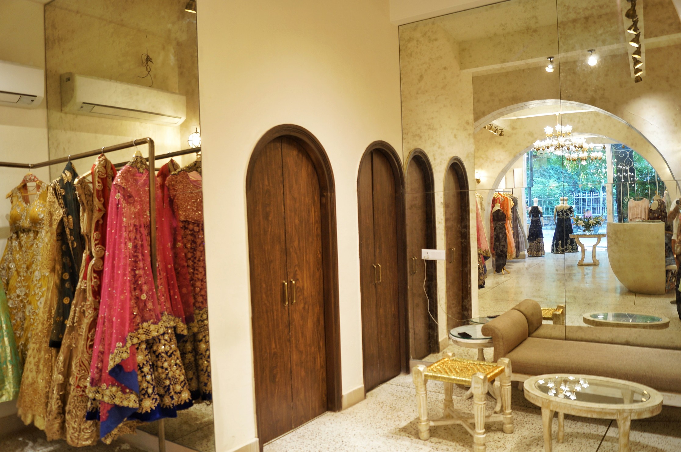
In this technologically advanced tide that we all are a part of, it has been inculcated in us that art is something confined only to the edifices of galleries and to certain other spaces where the sole motive of the art is to be nothing more than just an accentuating object. It is no more an inspiration that runs through the brush or an expression that is unfathomable and unstoppable. IT is no longer a part of the magnanimous structures that bind the facade of your society in one thread of 'modernisation'.
The impact of art and design in commercial space is often underestimated. Splashes of colour in a painting can alter the mood of a dull salon or retail store, as can a piece of unusual artwork can provide a talking point in a bland corporate space. But can artwork have a direct impact on commercial spaces and their functionality? It seems the answer is yes.
The notion that art in a commercial space is merely decorative and does not prove to be of any function has been dispelled by the fact that art in commercial space helps businesses address key challenges such as reducing stress, increasing creativity and encouraging expression of opinions. At a time when people increasingly want to work remotely and individualism is on the rise, art is a way of retaining thoughts, generating new ideas and encouraging the workforce to function efficiently
Art may be perceived as the deliberate attempt to a stray the focus of an individual from a confined motive to a brainstorm of thoughts. Art is the only language that communicates to millions of minds in their own unique terms.
Most designers consciously use art as part of their design element when designing commercial spaces, and organisations are moving away from seeing commercial art as purely an aesthetic choice, a trivial matter or an insignificant add-on. Those organisations that fully appreciate the benefits of displaying art through paintings, prints, photographs or sculpture in their offices – induce a positive impact that art has on their workforce – and give themselves a significant advantage over their competitors.
Current trends in the field of design suggest that art and design in a commercial space is highly under-rated. We at UB Designs, try to imbibe art in every project, making it meaningful by exuberating client’s goal, achievements and ethos through them.
We have enumerated the importance of why organisations and designers should specify more art in a commercial space:
ART MAKES A STATEMENT ABOUT A COMMERCIAL SPACE’S DESIGN –
An intelligently-curated art collection can reflect a company’s history and demonstrate its character, style and spirit to employees, clients, partners and prospects. In receptions, boardrooms and every other area of the workplace, a carefully selected piece of art can send a clear, yet subtle, message to those who see it, expressing and reinforcing brand values if appropriate.
ART ENGAGES STAFF -
Art can offer a highly effective remedy to the problem of engaging staff working in a commercial space. The staff feels more engaged and connected to the organisation and their efficiency can also increase. Offering users, a choice in the art they would like to see in their space is one of the many realistic ways to give them a say in the aesthetics of their workplace environment and show that the management of an organisation cares about and trusts its employees.
ART IMPACTS BUSINESS -
A small increase in the productivity of workers due to art and design has a cascading effect bringing prosperity and productivity. This in turn brings huge financial benefits to an organisation as a whole. Employees and users thrive in a positive and optimistic environment, and research suggests that having art in commercial spaces increases creativity, efficiency and even productivity.
DISPLAYING A SPECTACULAR ART COLLECTION TRASCENDS BEYOND COMMERCIAL VALUES
Many companies baulk at the idea of art in the workplace since the word itself conjures up images of a huge expense coming their way that would cost them a fortune, on the other hand a better design and tastefully selected art pieces in a commercial space would enhance the functionality and overall experience of the space, transcending beyond their commercial value.
Any architectural space is in the end dedicated towards the actions of, by and for the users of the space. Commercial spaces too, thus, have the consolidated need of rendering their surroundings in such a manner so as to enhance the activities of its users and art plays a significant role in making any space naturally humane. It successfully adds to the liveability quotient and hence results in creating an environment which in true essence is 'work-friendly'.


